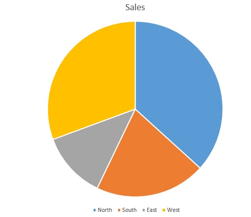
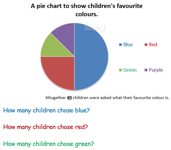
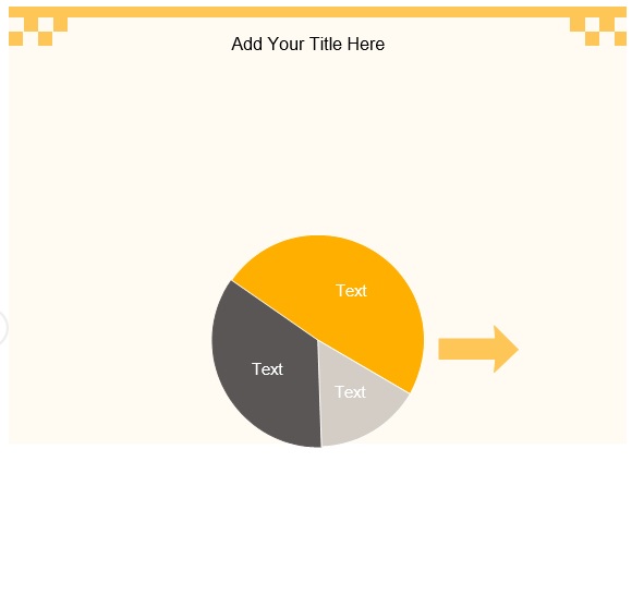
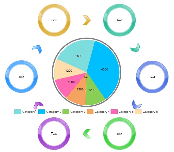
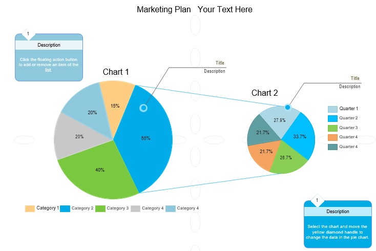
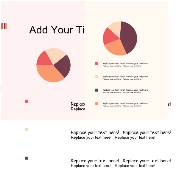
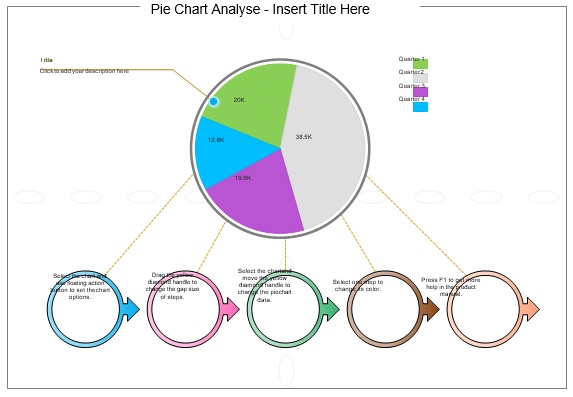
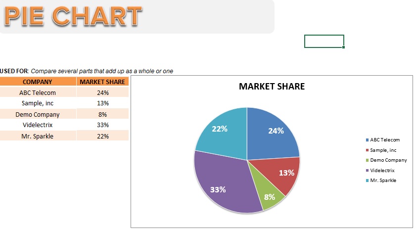
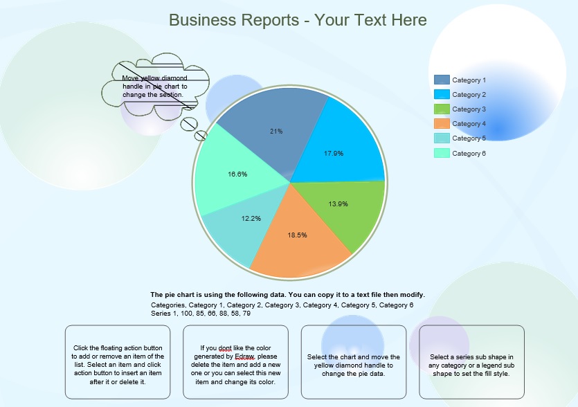
A pie chart template is used in schools and organizations to illustrate statistics. A pie chart looks like a pie that has a circular illustration. One category of data as part of the whole is represented by each slice of pie. If you use it for too many categories, it can become complicated.
Table of Contents
History of a pie chart:
Since the 1800s pie charts have been in existence used to illustrate maps and statistics. The benevolent Florence Nightingale introduced the use of the pie chart to illustrate statistics. During the Crimean War due to poor sanitary conditions, her chart illustrations referred as the attention of the Western World about mortality rates.
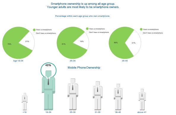
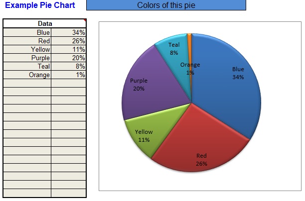
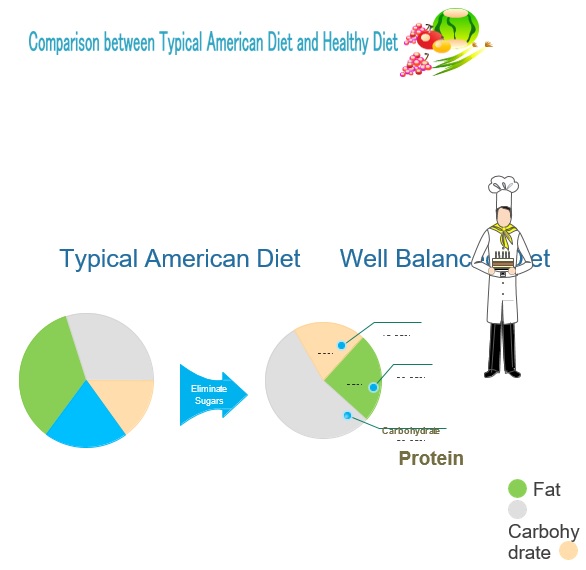
A pie chart is a circle-shaped chart with wedge-shaped sectors. Each sector illustrates proportions. All wedges of the pie should equal 100% and each wedge is a part of the whole circle. It is very easy to read at a mere glance due to its simplicity. Therefore, pie charts are usually used in education and for business presentations to display the proportions across different categories. These different categories include segments of populations, expenses, answers to surveys, and more.

What data can you display on a pie chart template?
Below are some examples of data that you can present using a pie chart;
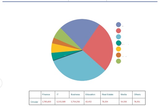
- Data that you can only display using small tables.
- The data that you categorize into ordinal or nominal categories. Nominal data, according to qualitative or descriptive information, is usually categorized. In the ordinal data, you can rank the different categories.
- Data that is whether proportional or percentage. You can give the percentage displayed by each of the categories next to its corresponding slice of the pie.
- Data that involves six or less than six categories. To distinguish the different sizes of the sectors, more categories would make it challenging for the eyes.
In addition, many people don’t know how to use a pie chart correctly. You should consider the following important aspects while creating your own pie chart design;
What it means
When taken as a whole, the slices of the pie charts should have meaningful concepts. Always keep in mind that a pie chart must easily make sense with a single glance.
Exclusivity
Never make the setting of exclusive numbers, percentages, or parts wrong into the pie chart. If there are any overlaps between the figures then try to reset your data. You can also use another type of chart. Moreover, think about how to interpret the categories with sizes that are almost similar. You should also check RACI Chart Template.
The purpose
It is not appropriate to use a pie chart for making comparison among between different parts. You just use it to indicate the relationship between overall and partial elements. Since each wedge shows a specific category so these charts can be very effective for categorical data groups.
Consider the value of the data
They are commonly used for six or fewer sets of varying values. Too many may cause difficulty in reading. This is because our eyes can’t relatively distinguish the sizes among sections. Also, pie charts are not useful for zero or negative values.
No axes
Axes aren’t shown as other elements in the pie chart. However, it’s the perimeter of the circle that actually contributes to the axis. Never use a pie chart if you want to present data trends.
How to draw your pie chart template?
You need a mathematical compass to draw a circle on a piece of paper. This way, your circle becomes both accurate and clean. Slide t pencil on the mathematical compass into the holder to attach it. Press the needle into the center where you want your pie chart to be. To make a circle, turn the compass around and keep the needle still to ensure precision.
After that, to create radius, you have to draw a line from the middle of the circle to its edge. Turn the pencil to the top part of the circle by holding the needle of the compass in place. After you loosen the hinge, draw a straight line with the pencil going down.
You may have to place a dot in the middle after you move the needle on the basis of what your compass’ style is. Then, draw the line with a ruler. With the help of a protector, line up the radius. At the bottom of the protractor, place the tiny hole right on the point of the needle of your compass. Now, you have to draw a straight line upward with the help of the 90-degree mark on the protractor. At the bottom of the protractor, the hole is the crosshair. You can use it for making perfect 90-degree angles. This is important to make the wedges of your pie chart.
By moving the crosshair, draw each of the slices every time you draw a new line. In the middle of the circle, keep the crosshair then add the first point of data to 90. On the exterior of the protractor, you can see this value. After that, make a mark for it. Now, draw a line from the mark you have created to the middle of the circle. By using the 90-degree point, draw each of the lines for the next part that you calculate.
In the end, color each of the segments and make a key for the pie chart. To find out what each of the slices refers to, color codes each section. Use a black marker to outline the circle and all of the pencil marks to make all the colors pop.

Conclusion:
In conclusion, a pie chart template is usually used for comparing statistics. It is known as pie chart due to its appearance. It is a circle having small sections that look like pie slices. Each slice is a portion of the total percentage and this way, it becomes easily understood. It is an excellent tool for sharing complex data.