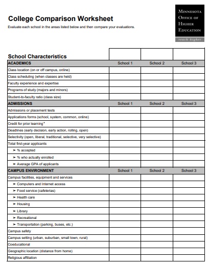
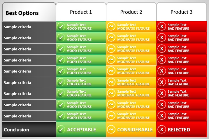
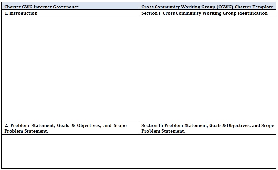
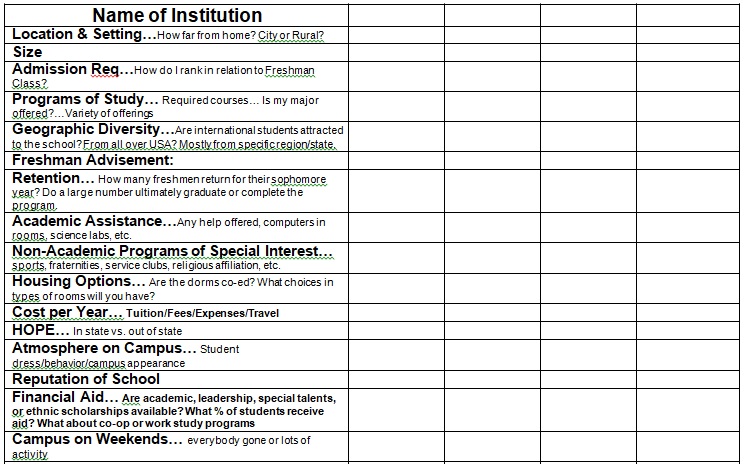
People use a comparison chart template when they have to decide between two seemingly equal options. It is a decision-making technique that pinpoints the advantages and disadvantages of each available option.
Table of Contents
- 1 What is a comparison chart?
- 2 Why should you use a comparison chart?
- 3 When to use a comparison chart template?
- 4 How to decide which type of comparison chart is best for you?
- 5 Where are the comparison charts used?
- 6 How do I create a comparison chart in MS Excel?
- 7 How to make your comparison chart easy to read and comprehend?
- 8 Who can use a comparison chart template?
- 9 What are the benefits of using comparison charts?
What is a comparison chart?
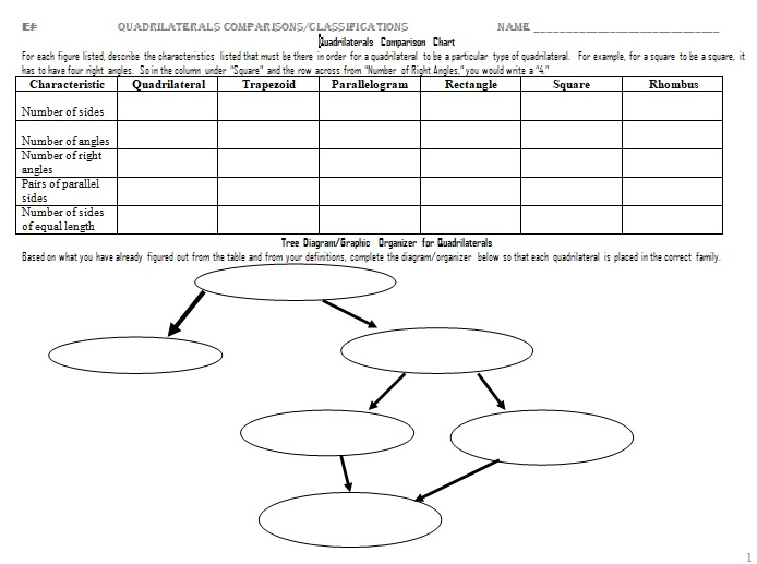
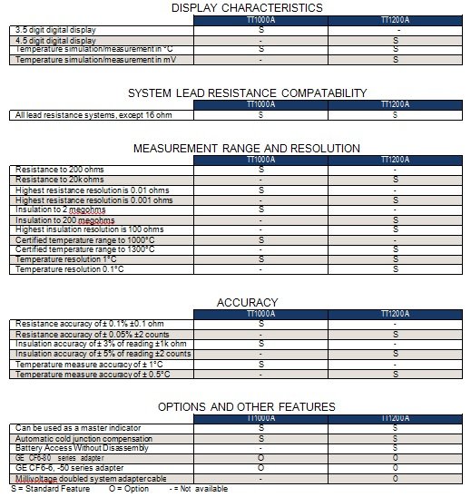
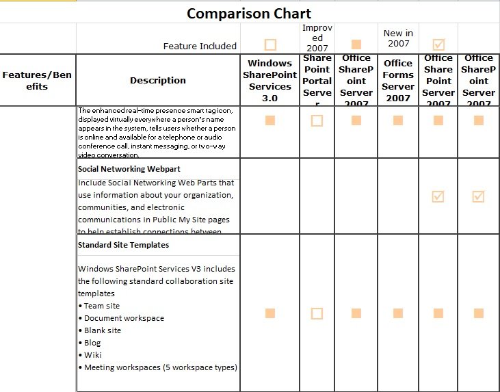
A comparison chart is a chart that gives a visual representation of the comparison of two or more items on different parameters. You can also include comparison diagrams such as line graphs, pie charts, and bar charts in it.
However, you can easily make comparison charts and these charts are very helpful for educational purposes. Furthermore, comparison charts are used to guide customers a side-by-side comparison between products when they are confused about them.
Why should you use a comparison chart?
A comparison chart is extremely useful if there are multiple options and you need to select just one. Keeping your conversation factual, helps you to arrive at logical conclusions together. Before settling on one specific option, this tool enables you to gain insights and articulate your point of view. Moreover, you should use the comparison chart in the following scenarios;
- Decision-making
- Ideation
- Planning
- Strategizing
- Meetings with clients
- Development
- Presentations
- Competitor analysis
- Research
When to use a comparison chart template?
You can use a comparison chart template under various circumstances. Let us discuss below some different circumstances where this chart can be used;
- To compare two or more variables
- For determining how different products are performing
- To gauge the effects of particular product parameters
- To make important decisions
- When you are looking for alternatives to particular issues
- To validate models or assess different possibilities
How to decide which type of comparison chart is best for you?
Here are some tips for you;
- First, determine the total number of variables you want to include in a chart. It’s up to you whether to include one, five, ten, or many variables in the same chart.
- Next, identify the total items you want to display per variable. You may want to display five items, fifty, or several thousand for each variable.
- Decide in the next step how the values you want to display whether over a longer period, can be grouped, or displayed within the several items. After answering these questions, you will become able to select the best comparison chart. Consider the following examples while selecting;
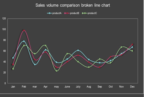
1- Select bar charts when creating comparisons
2- Choose line charts if you are creating trends
3- Choose the scatter charts if you are analyzing relationships or distributions
4- Select pie charts if you are making percentages or compositions
Where are the comparison charts used?
Comparison charts are used to compare two phenomena, tools, items, processes, or groups of data. They compare both quantitative and qualitative data. Comparison charts are used to determine the progress of various data groups in an organization. You can also be used various different fields to find out the better one among a group.
However, these charts are very helpful in both business and scientific fields. Moreover, if you are looking for something specific such as if you want to buy something and you are a little bit confused about two items, then this chart assists you by defining their benefits, disadvantages, features, prices, reviews, etc. Hence, comparison charts make it easy to select between them.

How do I create a comparison chart in MS Excel?
Here are 5 steps that will help you in making a comparison chart in MS Excel;
- At first, open MS Excel and select a blank workbook.
- Next, type your data into the workbook. You can either enter data by copy-paste or by typing manually. After entering the data, choose it.
- There is no built-in comparison chart or any comparison chart template in Excel. So for creating a comparison chart in Excel, go to the Home tab click on the Border icon. Choose all borders by clicking on the drop-down arrow. Borders highlight each cell when you click on All Borders. You can also do this by going to the Insert Tab and click on the Table.
- Hence, your comparison chart in Excel is prepared. Then, edit and customize it as you want. There are various formatting tools that can help you in changing the fonts and colors, adding images and watermarks, and much more. Use the Insert tab and home tab to find all the different options.
- When you have all done with the above steps save your final document. For this, go to the file and click on save.
How to make your comparison chart easy to read and comprehend?
Keep the following rules in your mind to make your chart easy to read and comprehend;
Use of colors
You can make your comparison chart easy to read by separating different variables with different colors. Don’t use over six colors in a single chart. This makes your chart too complex and interprets the brain of the readers. You shouldn’t use two different colors if you want to compare the variable over different times. Instead, you should use the same color. However, at some points, you can make it darker, lighter, medium, etc.
Set time axis
On the horizontal side, set the time axis. Make sure that the time progression run from the left side to the right side. Don’t skip any periods that have values under them because they are important in data presentation.
Deal with complex data
If you add too much data to your chart, it will look confusing. After creating the chart, you can see the data will look too complicated. Splitting the data and creating two or more separate charts would be better. Make your chart simple by highlighting variables and changing colors.
Sort out variables
Sort out different variables so that everyone will easily understand them. You should sort out them in ascending or descending order.
The values should be proportional to the numerical quantities
Number values and text representations are used in the charts. You should align each numerical value with the quantities it presents to avoid confusion.
Who can use a comparison chart template?
To use a comparison chart, you don’t need any secret knowledge or skills. When working with clients, students, or colleagues, many different professionals regularly use this template. These professionals are;
- Teachers
- Mediators
- Consultants
- Managers
- Facilitators
- Team leads
- Presenters
- Speakers
- Coaches
What are the benefits of using comparison charts?
Using Comparison charts provides you with various benefits, let us discuss below;
- Comparison charts can be made easily and are simple to read.
- With the help of this chart, estimations are fast and you can easily understand them.
- These charts are easily reachable to a huge variety of audiences.
- It assists you to summarize a huge amount of data.
- It allows the audience to get the data comparison at one view.
- Most importantly, a comparison chart makes your presentation visually interesting for the audience.
- It directly explains the key features of the data for the audience.