You can make hallways and stairs feel intentional and welcoming without big renovations. This article shows hallway and stairs ideas paint colors and simple styling tips to help you choose colors that match your home’s light, layout, and mood.
You will find options that range from bold accents to soft neutrals, plus guidance on how to keep transitions smooth between spaces. Use these ideas to pick colors that boost flow and give your home a clearer, more finished look.
Table of Contents
- 1 1) Moody Olive Accent Wall with White Trim
- 2 2) Terracotta Runner Wall with Matte Black Stair Rails
- 3 3) Soft Plaster Pink on Lower Half with Chair Rail
- 4 4) Repose Gray (Sherwin-Williams) Full Hallway Paint
- 5 5) Navy Cove Feature Wall at Stair Landing
- 6 6) Warm Beige Ombre from Entry to Staircase
- 7 7) Deep Charcoal with Glossy White Skirting
- 8 8) Pale Sage with Gallery Wall Frames
- 9 9) Terracotta Door Frames with Neutral Walls
- 10 10) Deep Teal Stair Risers with Natural Wood Treads
- 11 Factors That Influence Paint Color Choices
- 12 Tips for Creating Cohesive Transitions
1) Moody Olive Accent Wall with White Trim
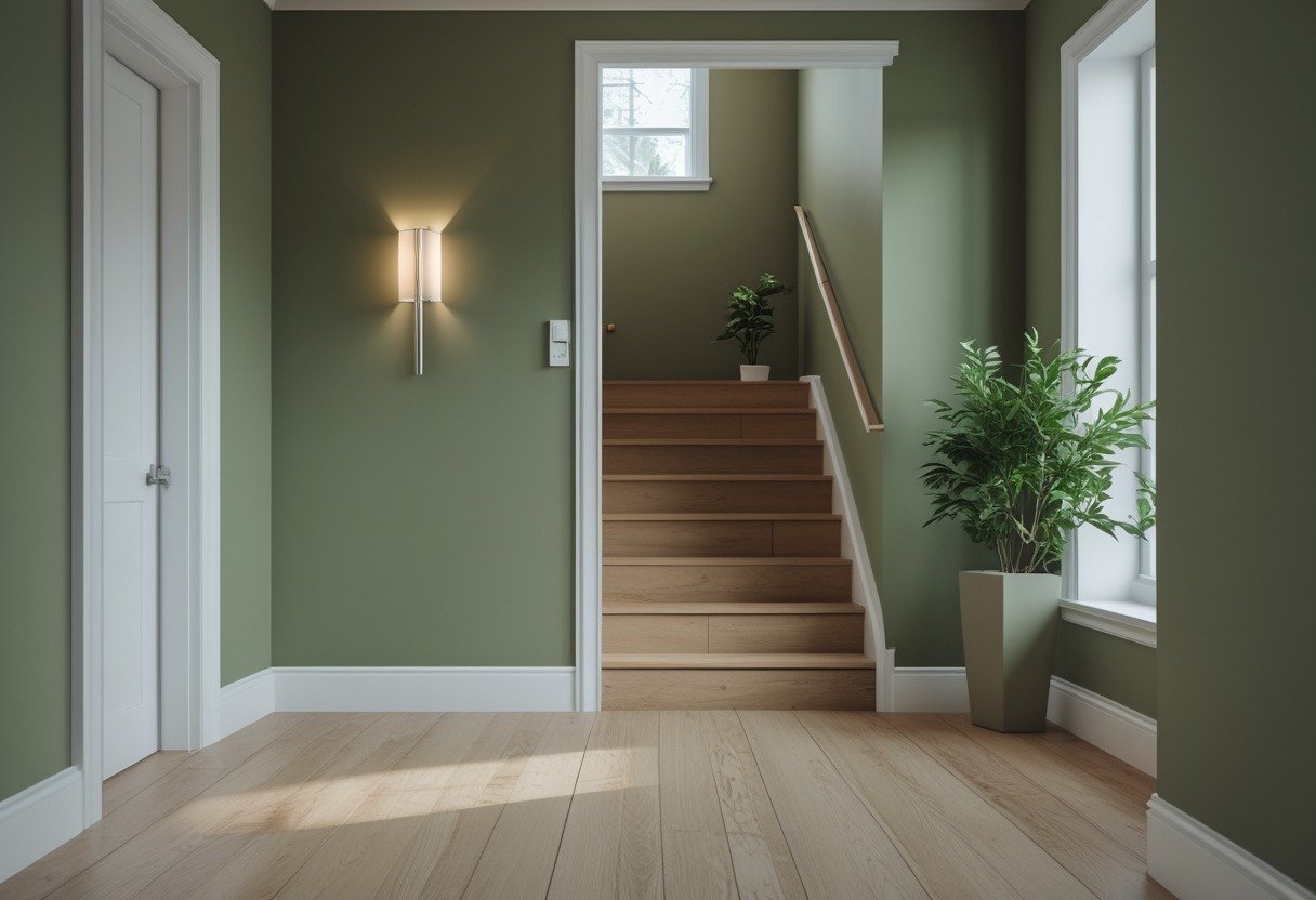
Choose a deep olive for an accent wall to add warmth and depth to your hallway or stairwell. Pair it with crisp white trim to keep lines clean and light levels balanced.
The olive creates a cozy, sophisticated feel without overwhelming narrow spaces. White trim highlights architectural details and makes the space look fresh and tidy.
Use satin or eggshell finish on the accent wall for subtle sheen. Keep adjacent walls lighter to preserve flow between rooms.
2) Terracotta Runner Wall with Matte Black Stair Rails
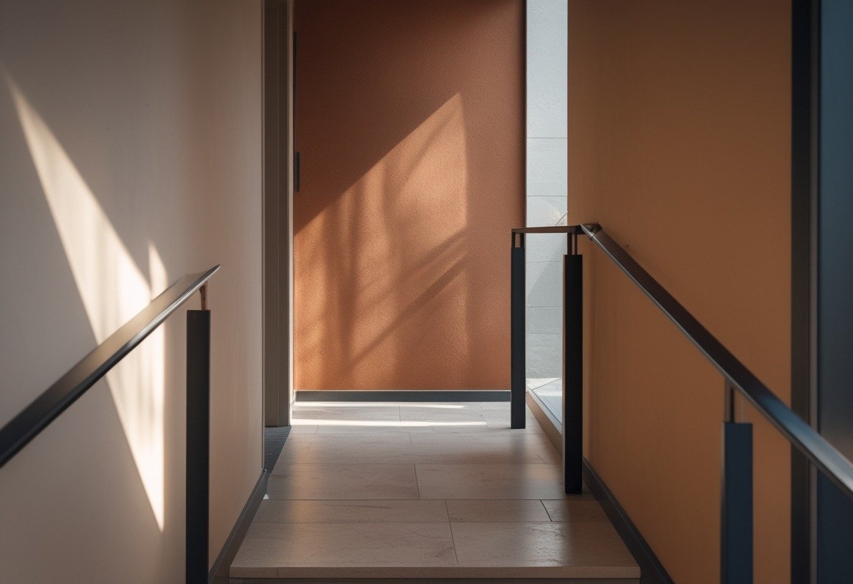
Choose terracotta for the runner wall to add warmth and depth to your hallway. The color reads earthy and calm, helping narrow spaces feel cozy without overwhelming them.
Pair terracotta with matte black stair rails for clear contrast and a modern touch. Black trims keep the look grounded and highlight the stair lines.
Use satin or eggshell on nearby walls to balance the matte runner wall. Keep flooring and accessories neutral to let the colors work together.
3) Soft Plaster Pink on Lower Half with Chair Rail
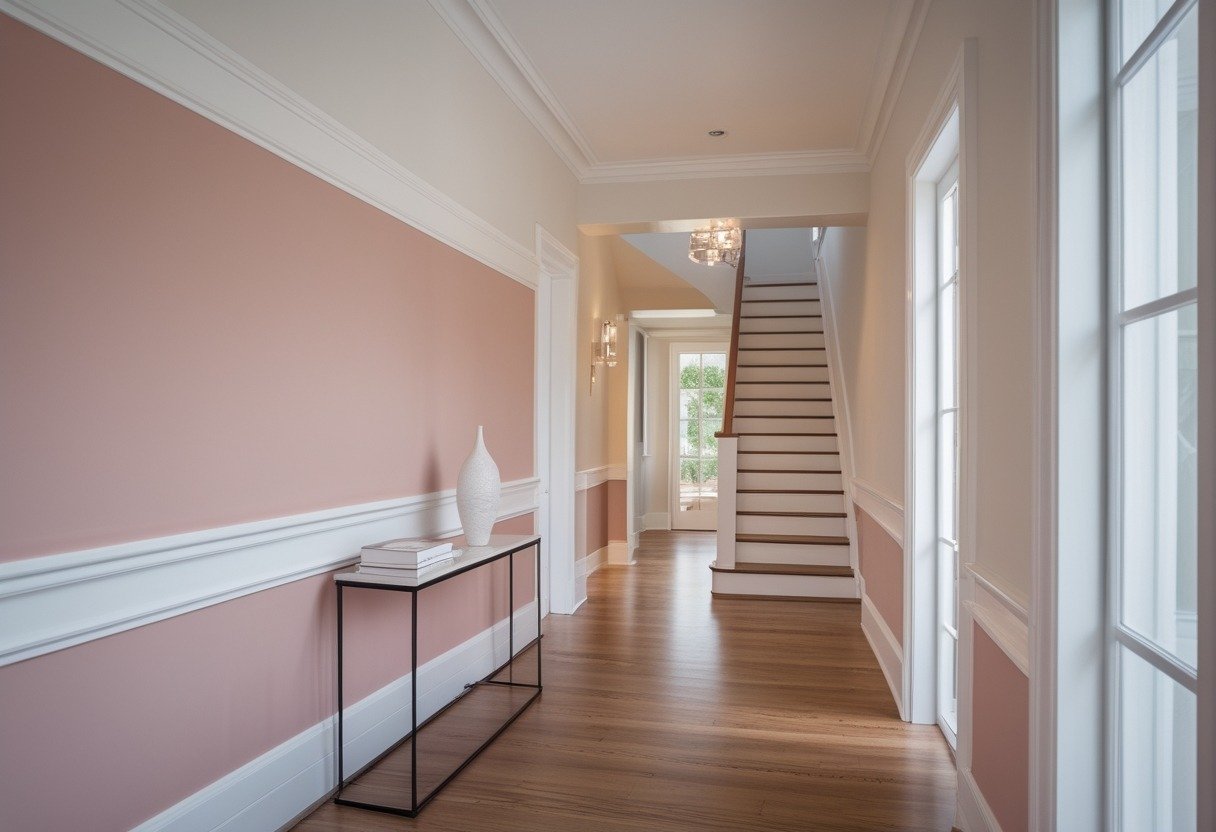
Paint the lower half of your hallway or stair wall in a soft plaster pink and keep the upper half a neutral white or cream. The chair rail adds a clean break and protects the wall from scuffs.
This combo feels warm without being overtly pink. It works well in narrow halls and lifts the look of plain woodwork.
Choose a muted plaster tone for a subtle, calming effect. Pair with matte finish for a refined, low-sheen appearance.
4) Repose Gray (Sherwin-Williams) Full Hallway Paint
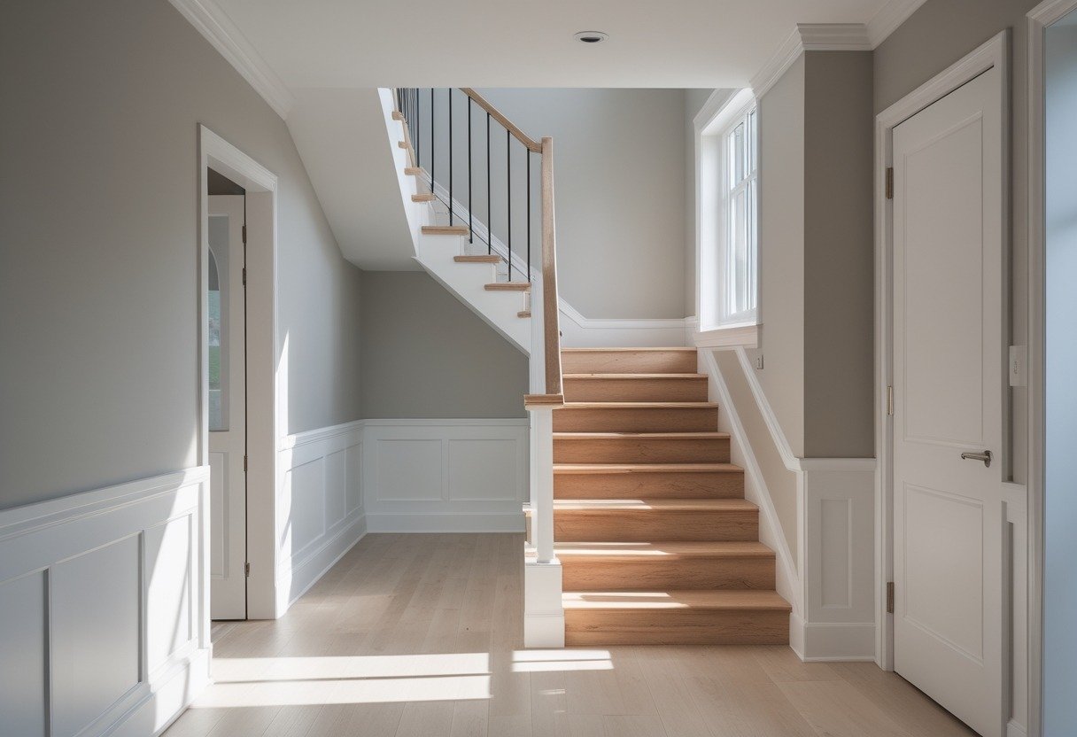
You can paint an entire hallway in Repose Gray for a calm, modern look that adapts to light. The color sits between warm and cool, so it reads differently at dawn, midday, and dusk.
Use crisp white trim to keep edges clear and add contrast. Repose Gray works with wood tones, black metal accents, or soft pastels if you want subtle color.
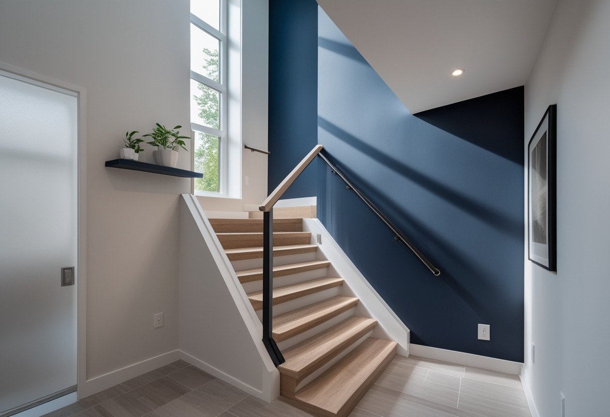
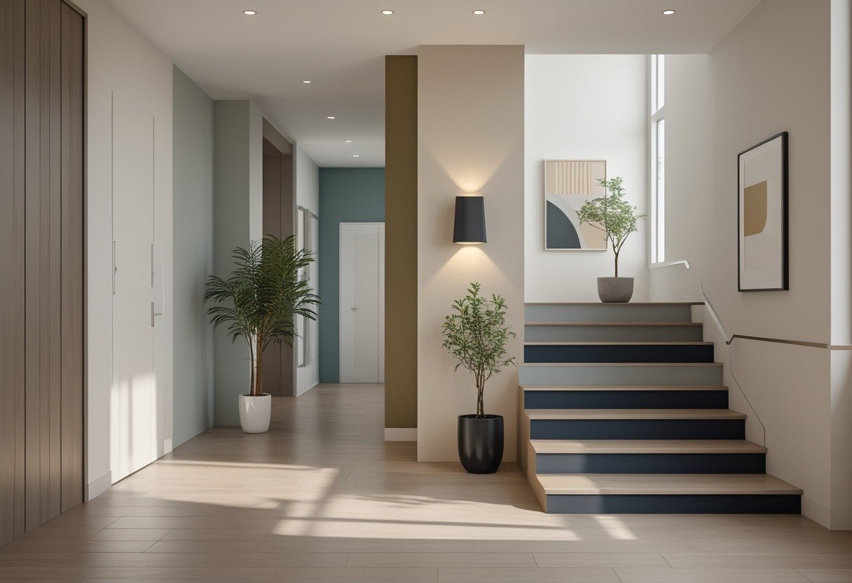
Paint the stair landing in a deep navy to create a calm, elegant focal point. You’ll draw the eye upward and add depth without overwhelming the space.
Pair navy with warm wood tones or brass hardware to keep the area inviting. Add a simple light fixture and a small gallery for balance.
6) Warm Beige Ombre from Entry to Staircase
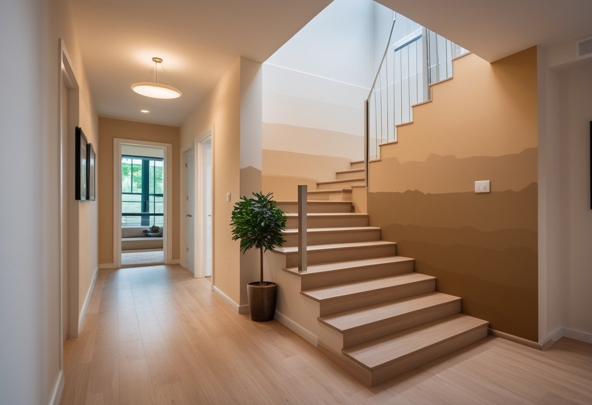
Choose a warm beige ombre to guide the eye from your entry into the stairwell. Start with a light creamy beige at the entry and deepen the tone gradually as you move up the stairs.
This gradient adds warmth and a calm flow between levels. It also highlights trim and architectural details without overwhelming the space.
Use matte or eggshell finishes to hide scuffs on high-traffic walls. Test samples on your wall to ensure the transition reads natural in your light.
7) Deep Charcoal with Glossy White Skirting
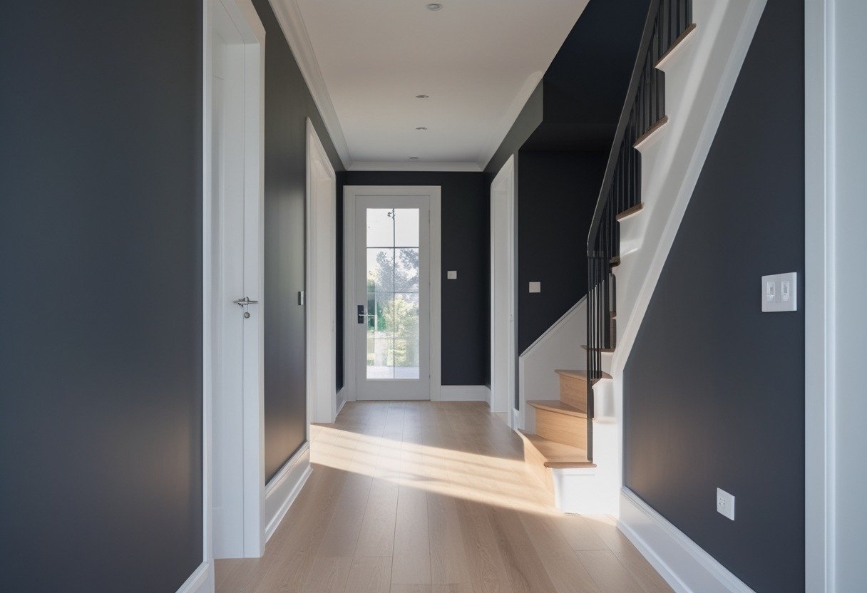
Use deep charcoal on walls to add depth without overwhelming the space. It hides scuffs and gives a modern, grounded look.
Pair it with glossy white skirting to create a crisp contrast and reflect light along the floor. The shine also makes cleaning easier in high-traffic areas.
Keep trim and doors bright white for a clean frame. This combo works well with warm wood floors or brass hardware for subtle warmth.
8) Pale Sage with Gallery Wall Frames
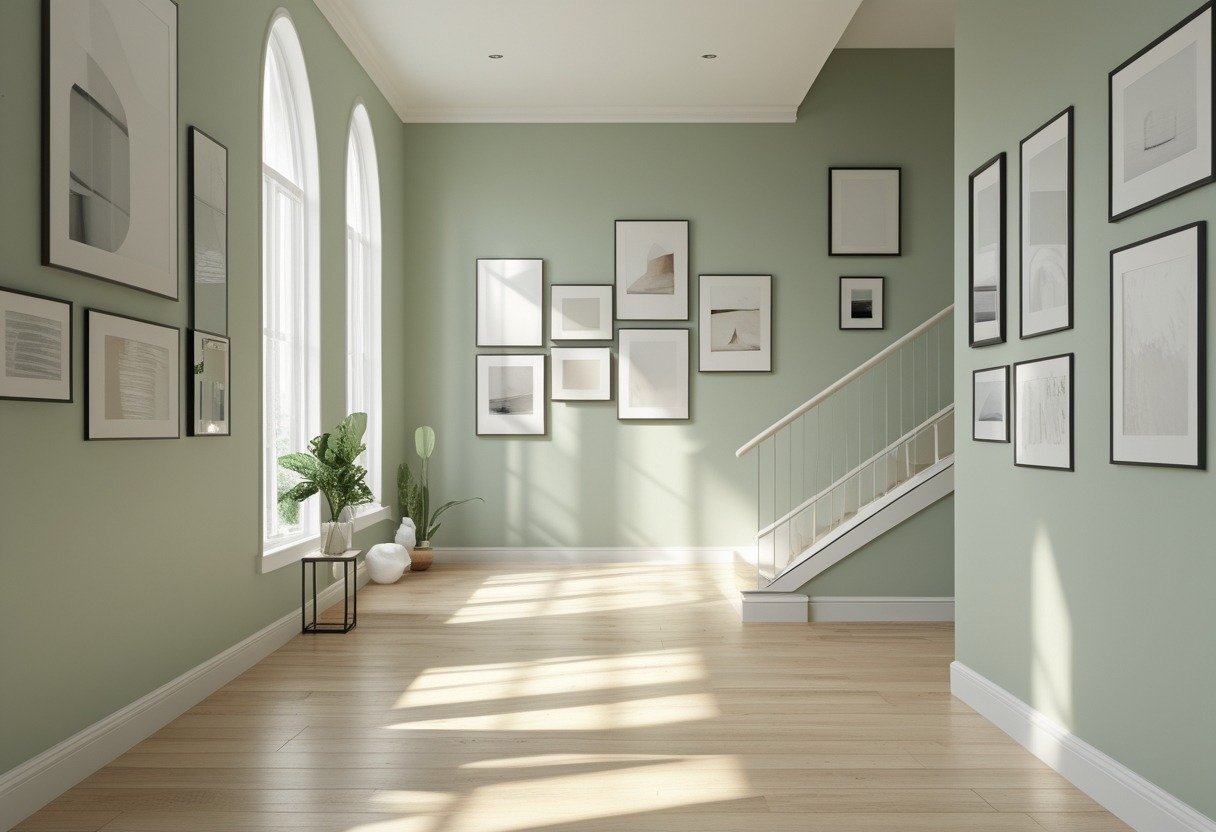
Pale sage creates a calm, neutral backdrop that lets artwork stand out without overwhelming the space. Use matching or varied frames to give the gallery a collected, intentional look.
Keep mats white to brighten each piece and create visual breathing room. Arrange frames in a tight grid or a relaxed cluster depending on your hallway width.
Balance the gallery with simple lighting, like picture lights or a slim runner fixture, to make colors pop and guide the eye down the stairs or corridor.
9) Terracotta Door Frames with Neutral Walls
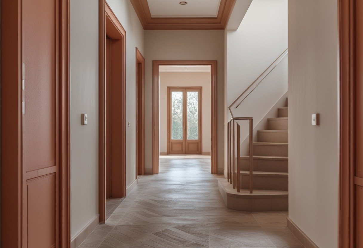
Paint your door frames terracotta to add warmth and focus without overwhelming the space. This contrast draws the eye and gives your hallway or stairwell a crafted, intentional look.
Keep the walls neutral—cream, soft grey, or pale beige—to let the terracotta pop and to maintain light. You can repeat terracotta in small accents like a runner or a vase to tie the scheme together.
10) Deep Teal Stair Risers with Natural Wood Treads
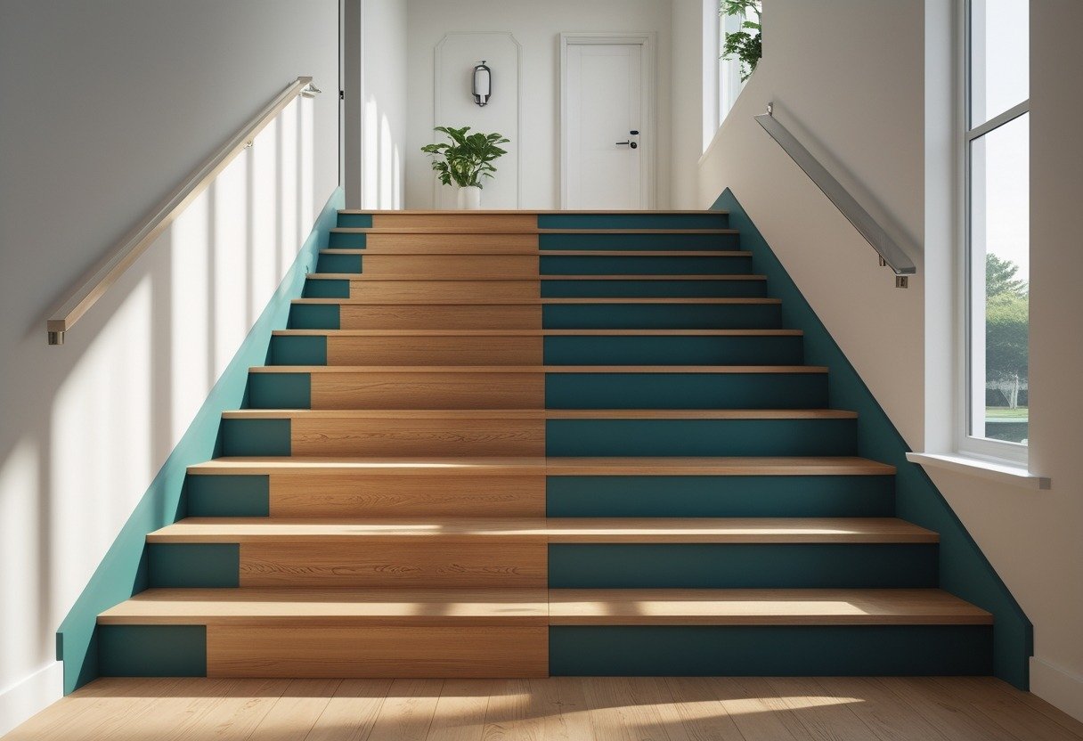
Deep teal risers add rich color without overpowering the space. You get a modern, calm look that pairs well with many wall colors.
Natural wood treads bring warmth and contrast. The wood hides wear better and keeps the stairs feeling grounded.
Use a durable, high-traffic paint for the risers and a clear sealant on the treads. This keeps the finish lasting and easy to clean.
Factors That Influence Paint Color Choices
Light level, room shape, and the colors already in your home will shape which paint tones work best. Think about how much natural light you get, which architectural details you want to highlight, and how floors, rugs, and furniture will interact with wall color.
Lighting and Natural Brightness
Check how many windows and what direction they face. South-facing halls get warm, bright light; you can use cooler grays or muted blues without the space feeling dull. North-facing or windowless stairwells are cooler and can feel dim; choose warm neutrals, soft whites with a hint of yellow, or pale beige to add warmth.
Test paint on a large poster board and view it at different times of day. Artificial light matters too: warm (2700–3000K) bulbs make colors richer, while cool (4000–5000K) bulbs make them look sharper. Note the bulb temperature in your fixtures before picking a shade.
Architectural Features
Identify features you want to emphasize: a staircase railing, newel post, moldings, or a built-in niche. Darker or contrasting colors make railings and balustrades pop. Use lighter shades on wall planes to keep sightlines open and choose a contrasting stair riser color for visual interest.
For textured or ornate moldings, pick a slightly lighter or glossier finish so they stand out. If you want the architecture to recede, match molding to the wall color. Consider using an accent wall on a landing to draw the eye upward.
Existing Décor and Flooring
Match paint to permanent elements first: hardwood tones, tile colors, or large rugs. Warm-toned floors (honey, oak, walnut) pair well with warm neutrals and muted greens. Cool-toned floors (gray, bleached, slate) work with cool grays, soft blues, and crisp whites.
Account for undertones in carpets and upholstery. Bring a small fabric or floor sample when you shop and compare it under your hall lighting. If you plan to change decor soon, choose flexible neutrals like greige or soft taupe that adapt to new furniture and art.
Tips for Creating Cohesive Transitions
Match tones, repeat small accents, and pick anchor colors to tie the hallway, landing, and stairs together. Use a clear rule for where colors change so the flow feels planned, not accidental.
Blending With Adjacent Spaces
Choose one anchor color that appears in both the hallway and the nearest room. Use it on a trim, runner, or a single wall to create a visible link without repainting entire rooms.
If rooms have strong colors, pick a neutral hallway shade that shares an undertone—warm beige for warm reds, cool gray for blues—to keep sightlines calm.
Use a repeat element to strengthen the link: a rug that borrows tones from both spaces, throw pillows, or framed art with matching mats.
Keep contrast moderate where rooms meet. A sudden, high-contrast shift feels jarring; a softer change preserves visual flow and makes movement from one area to the next easier on the eyes.
Using Color to Accentuate Staircase Design
Paint choices can highlight steps, balusters, or the wall plane behind the stairs. Paint risers a lighter shade and treads a darker, durable color to show step edges and improve safety.
Use a bold color on the stair wall to create depth if the staircase sits in a narrow space. That color can echo a small accent in adjacent rooms to keep the palette unified.
For architectural details, paint spindles or handrails in a contrasting trim color to draw attention to craftsmanship.
Choose durable, washable finishes for high-traffic stair parts, and test samples under the stair lighting before committing to the full coat.