Listen, I get it. You’re scrolling through Pinterest at 2 AM, desperately searching for that perfect kitchen backsplash idea that’ll make your space feel less “meh” and more “wow.”
Been there, done that, got the renovation budget to prove it. And if you’re anything like me, you’ve probably considered green backsplashes at least once – maybe twice if you’re feeling adventurous.
Here’s the thing: green backsplashes work in ways other colors simply can’t. They bring nature indoors, they play nice with pretty much every cabinet color, and they somehow manage to look both trendy and timeless.
Plus, after helping my sister redesign her kitchen last year (and spending way too many hours debating between sage and emerald), I’ve learned a thing or two about what actually works in real kitchens, not just those magazine-perfect ones.
So grab your coffee (or wine – no judgment here), and let’s talk about 15 green backsplash ideas that’ll transform your kitchen from boring to brilliant. Trust me, by the end of this, you’ll be itching to start your own kitchen makeover.
Table of Contents
Emerald Elegance
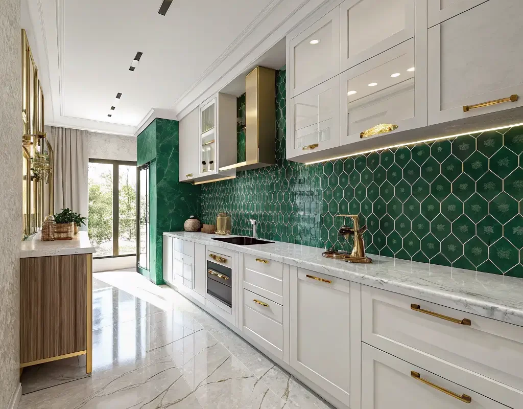
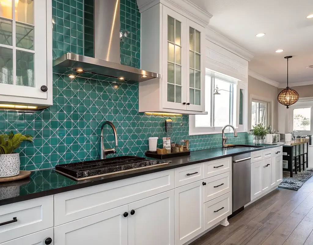
Remember when everyone thought emerald green was “too bold” for kitchens? Yeah, those people clearly haven’t seen what this jewel tone can do to a space. Emerald backsplashes scream luxury without actually screaming, if that makes sense.
I installed emerald subway tiles in my own kitchen three years ago, and honestly? Still obsessed. The deep, rich green catches light in ways that make even my morning coffee routine feel fancy. You want to pair these babies with brass or gold fixtures – the combination creates this old-money vibe that’ll have your dinner guests thinking you hired an expensive designer.
What really sells emerald though? Its versatility surprises everyone. White cabinets? Classic combo. Dark wood? Absolutely gorgeous. Even those trendy two-toned kitchens work brilliantly with emerald as the star.
Making Emerald Work in Small Spaces
Now, before you panic about emerald overwhelming your tiny kitchen, hear me out. The trick lies in the finish:
- Glossy tiles reflect light and actually make spaces feel larger
- Matte finishes create depth without the drama
- Mix both for a textured look that adds dimension
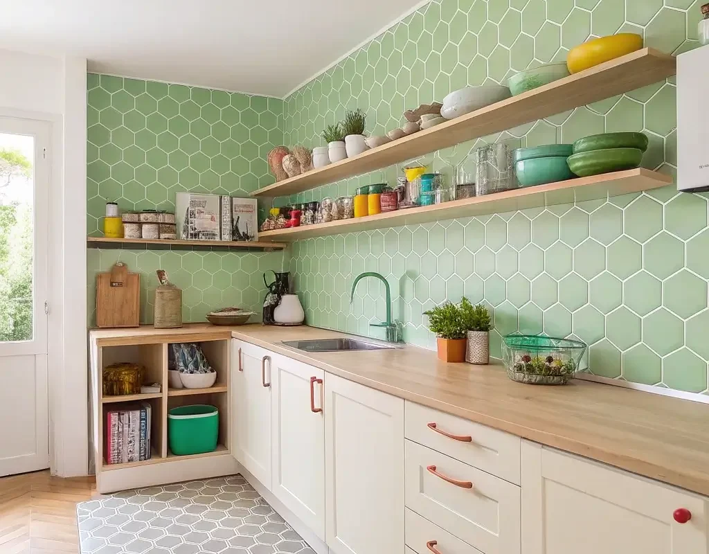
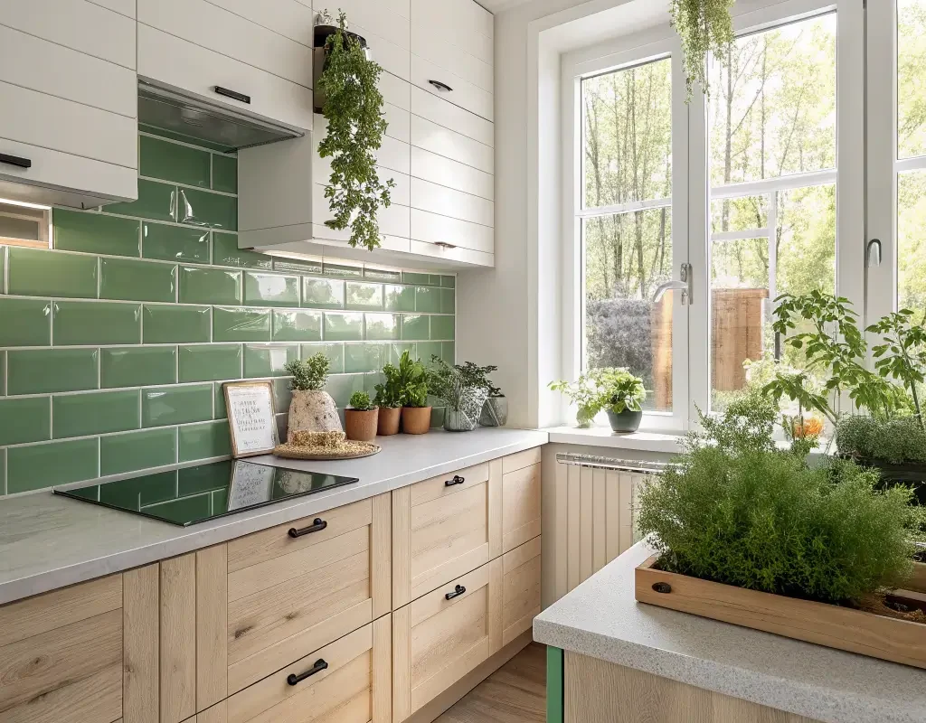
Minty Fresh Vibes
Okay, who else immediately thinks of toothpaste when someone mentions mint green? Just me? Well, push past that association because mint backsplashes bring serious retro-cool energy to any kitchen.
This shade works magic in kitchens that need a personality boost without committing to something too intense. I helped my neighbor install mint hexagon tiles last summer, and the transformation? Mind-blowing. Her 1950s ranch kitchen went from dated to deliberately vintage in the best way possible.
Mint plays exceptionally well with:
- Black and white checkered floors (hello, diner vibes!)
- Natural wood accents
- Stainless steel appliances
- White marble countertops
The beauty of mint? It makes everything feel cleaner somehow. Maybe it’s that toothpaste association after all 🙂
Also Read: 10 Dreamy Green Kitchen Walls Ideas for Modern Cozy Kitchens
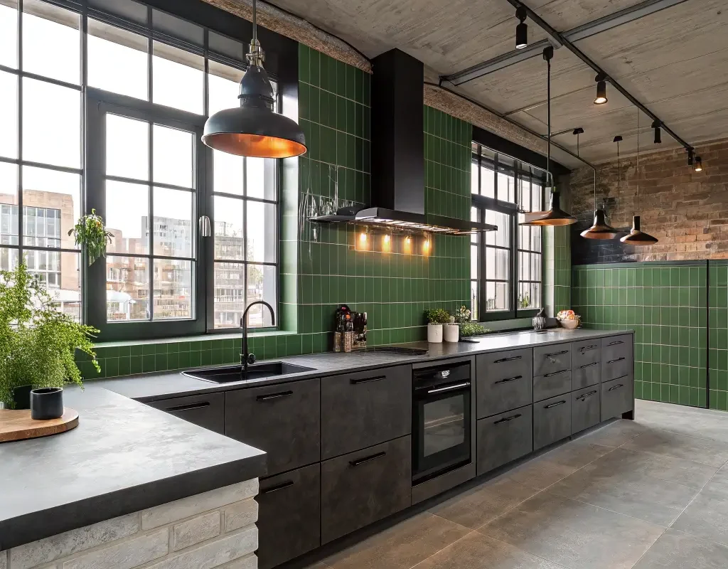
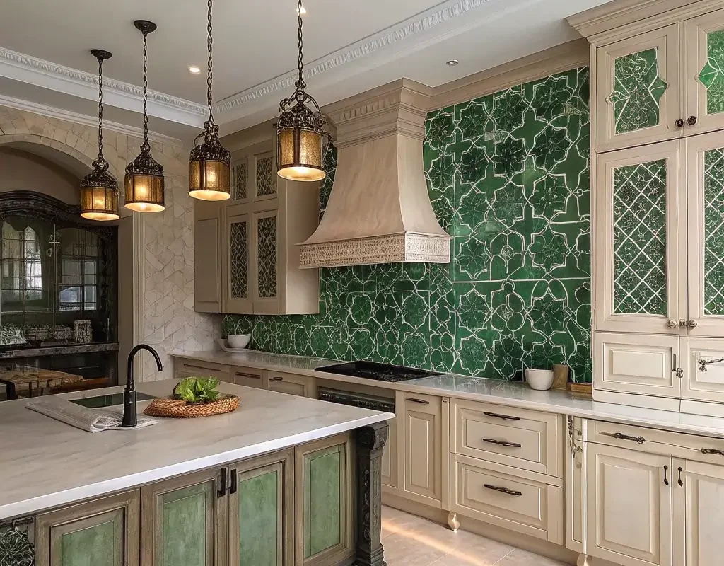
Forest Chic
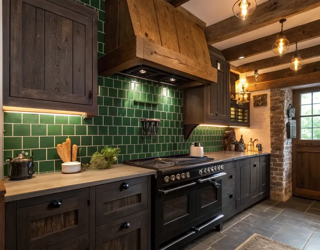
Forest green backsplashes hit different when you’re going for that cozy cabin-meets-modern-sophistication look. This deeper, moodier green creates instant atmosphere – the kind that makes you want to cook elaborate dinners and actually use those fancy serving platters you bought.
I’ve seen forest green work absolute wonders in open-concept kitchens. The color grounds the space without making it feel heavy. Plus, if you’re working with limited natural light (apartment dwellers, I see you), forest green somehow makes artificial lighting feel warmer and more inviting.
Texture Matters with Forest Green
Don’t just slap up any forest green tile and call it a day. The texture makes or breaks this look:
- Handmade tiles with slight variations create organic movement
- Vertical stacking patterns elongate your walls
- Mixed sizes add visual interest without overwhelming
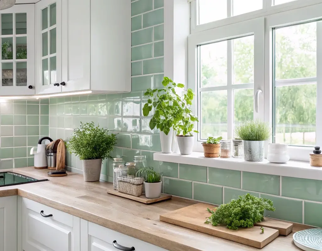
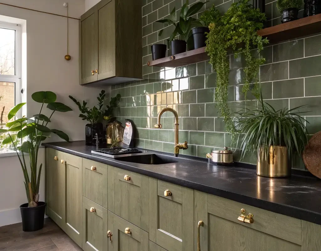
Sage Serenity
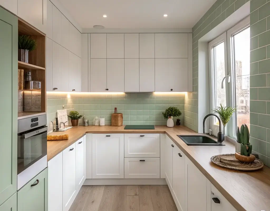
Can we talk about how sage green became everyone’s favorite neutral? Because honestly, it deserves the hype. Sage backsplashes bring instant calm to even the most chaotic kitchens – and trust me, with three kids and a dog, I know chaos.
What makes sage special? It’s basically the Switzerland of colors – neutral enough to work with everything, interesting enough to make a statement. My best friend went with sage glass tiles, and her kitchen literally looks like it belongs in a wellness retreat. The color shifts throughout the day too, appearing more green in morning light and grayer by evening.
Olive Oasis
Olive green might sound like your grandmother’s kitchen (and maybe it was), but modern olive backsplashes have serious sophisticated energy. This earthy tone brings warmth without the yellow undertones that plague some greens.
I recently saw olive penny tiles in a kitchen, and wow – the texture combined with that muted green created this incredible depth. Olive works particularly well if you’re dealing with:
- Mixed metal fixtures (it bridges gold and silver beautifully)
- Natural stone countertops
- Both light and dark cabinetry
Why Olive Beats Other Earth Tones
Ever notice how beige feels boring but olive feels intentional? That’s the power of green undertones. They add life to neutral palettes without demanding attention.
Also Read: 12 Fresh Olive Green Kitchen Ideas That Look Amazing
Jade Glow
Jade backsplashes bring this incredible luminosity that other greens can’t touch. The stone-inspired color has natural depth that makes even basic subway tiles look expensive. FYI, if you’re on a budget but want that high-end look, jade’s your answer.
My cousin installed jade-colored ceramic tiles that honestly look like they cost five times what she paid. The secret? Going with larger format tiles and minimal grout lines. The continuous color creates this serene, spa-like atmosphere that makes doing dishes almost enjoyable. Almost.
Pistachio Pop
Who knew ice cream colors worked in kitchens? Pistachio green backsplashes add unexpected whimsy without going full cartoon. This softer, yellow-toned green brings instant sunshine to north-facing kitchens that desperately need warmth.
I’ll admit, I was skeptical about pistachio at first. Seemed too trendy, too “of the moment.” But seeing it in person? Game changer. The color has this chameleon quality – playful in bright light, sophisticated in evening ambiance. Plus, it makes white appliances look intentional rather than basic.
Mossy Modern
Moss green backsplashes create this incredible organic-meets-contemporary vibe that feels both grounded and fresh. Think of it as bringing the forest floor into your kitchen, minus the actual dirt and bugs.
What surprised me most about moss green? How well it handles different lighting situations. Under-cabinet LEDs make it glow, pendant lights create gorgeous shadows, and natural light brings out subtle color variations you’d never notice otherwise.
Pairing Moss with Other Elements
The key to nailing mossy modern:
- Concrete countertops for industrial edge
- Light wood cabinets for Scandinavian feels
- Black hardware for dramatic contrast
- Copper accents for warmth
Also Read: 10 Fabulous Dark Green Kitchen Ideas and Perfect Layouts
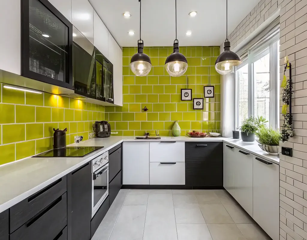
Lime Light
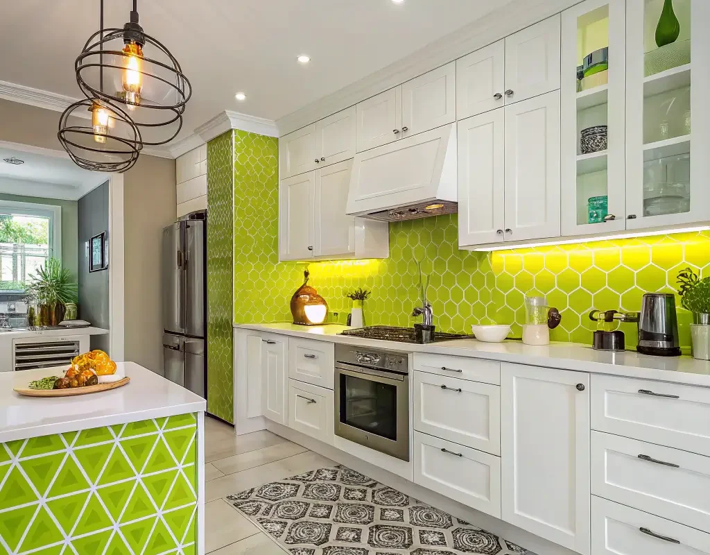
Ready for something bold? Lime green backsplashes inject instant energy into any kitchen. This isn’t for the faint of heart, but if you’re brave enough, the payoff rocks.
My sister-in-law went full lime with glossy tiles, and her kitchen became the party hub of their house. Something about that vibrant green makes people want to gather, cook together, and actually enjoy being in the kitchen. Who would’ve thought?
The trick with lime? Balance, balance, balance. You need plenty of neutral elements to prevent sensory overload.
Avocado Accents
Before you roll your eyes and mutter “70s nightmare,” hear me out. Modern avocado green has evolved past its unfortunate appliance phase. Today’s avocado backsplashes bring sophisticated earthiness that feels fresh, not dated.
I installed avocado hexagon tiles behind my stove last year, and the number of compliments? Ridiculous. The color reads as unexpectedly neutral while adding way more personality than gray ever could. Plus, it hides splatter stains better than lighter colors (practical win!).
Celadon Charm

Celadon sits somewhere between green and gray, creating this dreamy, ethereal quality that makes kitchens feel larger and airier. If you’re indecisive about committing to full green, celadon’s your gateway drug.
This pale green-gray works magic in kitchens with:
- Limited square footage
- Minimal natural light
- Mixed style elements
- Rental restrictions (it’s subtle enough that landlords rarely object)
Chartreuse Chic
Chartreuse backsplashes aren’t for everyone, but if you’ve got the confidence to pull it off, this yellow-green hybrid creates unforgettable spaces. IMO, it’s the perfect choice for creative types who want their kitchen to reflect their personality.
One client chose chartreuse glass tiles, and her kitchen became this incredible art piece. The color energizes morning routines and creates fascinating shadows during sunset cooking sessions. Just remember – a little chartreuse goes a long way.
Taming the Chartreuse Beast
Want chartreuse without overwhelming your space? Try these approaches:
- Use it as an accent behind open shelving
- Pair with deep navy cabinets for balance
- Mix with white subway tiles in a pattern
- Choose matte finishes to soften the intensity
Green Mosaic Magic
Why choose one green when you can have them all? Mosaic backsplashes combining multiple green shades create visual interest that never gets boring. Every time you look, you notice something new.
I helped design a mosaic backsplash using five different green tiles, and the result? Pure magic. The varying shades create movement and depth that solid colors can’t achieve. Plus, mosaics hide imperfections better than uniform tiles – perfect for older homes with less-than-perfect walls.
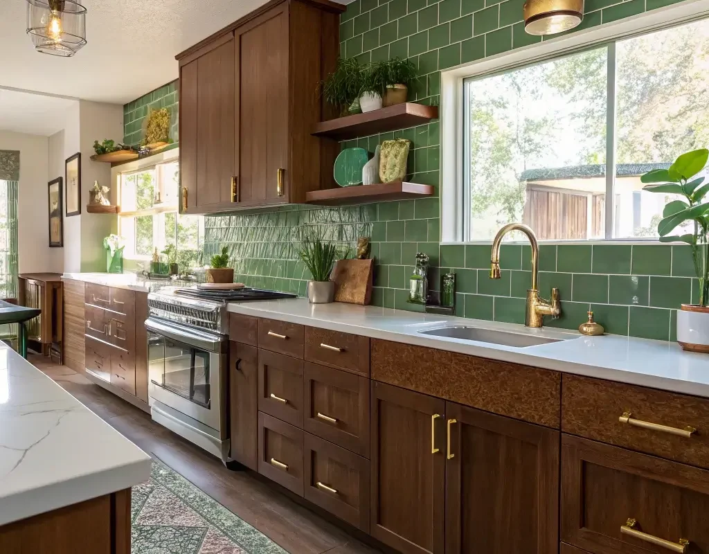
Teal Twist
Technically blue-green, but who’s counting? Teal backsplashes bridge the gap between cool and warm, making them perfect for kitchens that can’t decide on a temperature palette.
My own mother finally replaced her dated backsplash with teal arabesque tiles, and the transformation knocked everyone’s socks off. The color brings seaside vibes without the cheesy nautical theme. It works especially well with:
- Warm wood tones
- White or cream cabinets
- Mixed metal finishes
- Both modern and traditional styles
Herb Garden Haven
Last but definitely not least, herb green backsplashes bring that fresh-from-the-garden feeling straight into your kitchen. This muted, gray-green shade feels organic and calming – basically meditation in tile form.
What makes herb green special? It looks intentionally curated rather than randomly chosen. The color suggests someone who actually cooks (even if you’re more of a takeout person :/). Plus, it photographs beautifully for those Instagram-worthy kitchen shots we all secretly want.
Creating Your Herb Garden Look
To nail the herb garden aesthetic:
- Choose handmade or artisan tiles for authenticity
- Add actual herbs on floating shelves or windowsills
- Incorporate natural textures like wood and stone
- Keep hardware simple and understated
Making Your Green Backsplash Dreams Reality
So which green speaks to you? Whether you’re drawn to bold emerald or subtle sage, the right green backsplash transforms your kitchen from functional to fabulous. Remember, this isn’t about following trends – it’s about creating a space that makes you happy every single day.
Here’s my final advice: order samples, live with them for a week, and see how they look in different lights. What looks amazing online might feel completely wrong in your actual space. And please, don’t let anyone talk you out of the green you love because it’s “too bold” or “too trendy.” Your kitchen, your rules.
The beauty of green backsplashes? They grow on you (pun absolutely intended). Three years into my emerald tiles, and I still smile every morning when I walk into my kitchen. That’s the kind of design choice that pays dividends way beyond any trendy update.
Ready to take the plunge? Start with the shade that made your heart skip a beat while reading this. Trust that instinct – it’s usually right. And when you’re standing in your newly transformed kitchen, admiring how that perfect green backsplash pulls everything together, you’ll wonder why you waited so long to bring nature’s favorite color indoors.
Who knows? You might even start cooking more. Or at least enjoying your morning coffee a little bit extra. Either way, that green backsplash will be there, making your kitchen feel less like a room and more like home.