Remember that feeling when you walked into your friend’s apartment and their vinyl collection wasn’t just stored away but displayed like museum pieces? Yeah, that’s when I realized my blank walls were basically crying out for some album cover love.
If you’re anything like me, you’ve probably got a stack of records collecting dust or digital albums you adore but never get to appreciate visually. Here’s the thing – album covers are literally art pieces waiting to transform your walls from boring to brilliant. And trust me, you don’t need to be some interior design wizard to pull this off.
Let’s talk about turning those album covers into wall decor that’ll make every guest stop and stare. I’ve tried most of these ideas myself (with varying degrees of success, but hey, we learn from our mistakes, right?), and I’m pumped to share what actually works.
Table of Contents
- 1 Floating Frame Gallery
- 2 Grid Wall Display
- 3 Vintage Record Shelves
- 4 Color-Coded Arrangement
- 5 DIY Canvas Prints
- 6 Minimalist Floating Panels
- 7 Geometric Pattern Wall
- 8 Album Cover Collage
- 9 Shadow Box Frames
- 10 Rotating Seasonal Display
- 11 Backlit Wall Frames
- 12 Mixed Media Wall Art
- 13 Leaning Shelf Display
- 14 Floor-to-Ceiling Gallery
- 15 Themed Music Corner
- 16 Making It All Work Together
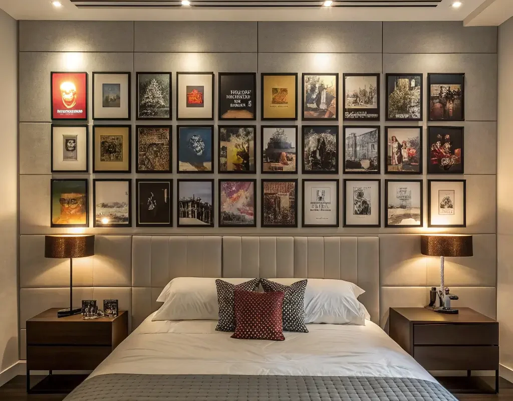
Floating Frame Gallery

This one’s my personal favorite because it looks way more expensive than it actually is. Floating frames give your album covers that professional gallery vibe without the gallery price tag.
You basically sandwich your album cover between two pieces of glass or acrylic, creating this amazing suspended effect. The best part? You can see both the front and back of the album if you want. I started with just three floating frames above my couch, and now half my living room wall looks like a contemporary art exhibit.
Getting the Look Right
Here’s what makes floating frames work so well:
- No matting needed – the album art speaks for itself
- Creates depth and dimension on your wall
- Works with literally any decor style
- Super easy to swap albums when you’re feeling a change
Pro tip: Mix square album covers with rectangular ones if you’ve got some vintage singles or EPs. The variety keeps things interesting, and nobody expects that kind of detail.
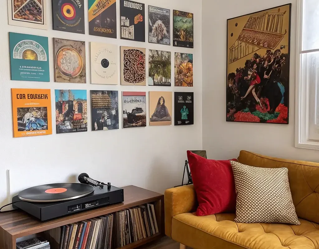
Grid Wall Display
Ever walked into Urban Outfitters and wondered how they make their walls look so effortlessly cool? Grid displays, my friend. This method transforms chaos into organized beauty, and it’s surprisingly therapeutic to set up.
I remember spending an entire Sunday afternoon arranging and rearranging my grid until it felt just right. Start with nine albums (3×3 grid) if you’re nervous about commitment. You can always expand later – and trust me, you will.
The key here is maintaining equal spacing between each cover. I use a ruler because I’m that person, but you could probably eyeball it if you’re blessed with spatial awareness. About 2-3 inches between frames usually looks perfect.
Making Your Grid Pop
Consider these elements:
- Stick to one frame color for cohesion
- Play with album genres for visual interest
- Create mini-stories within your grid
- Leave some breathing room around the entire display
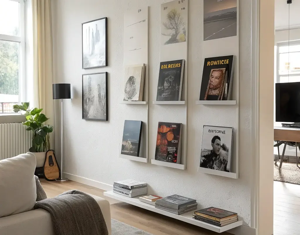
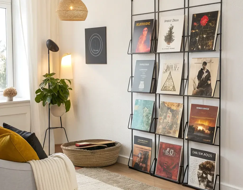
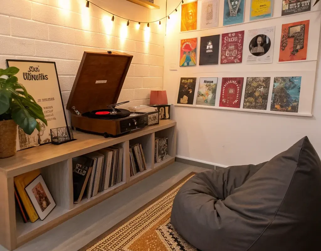
Vintage Record Shelves
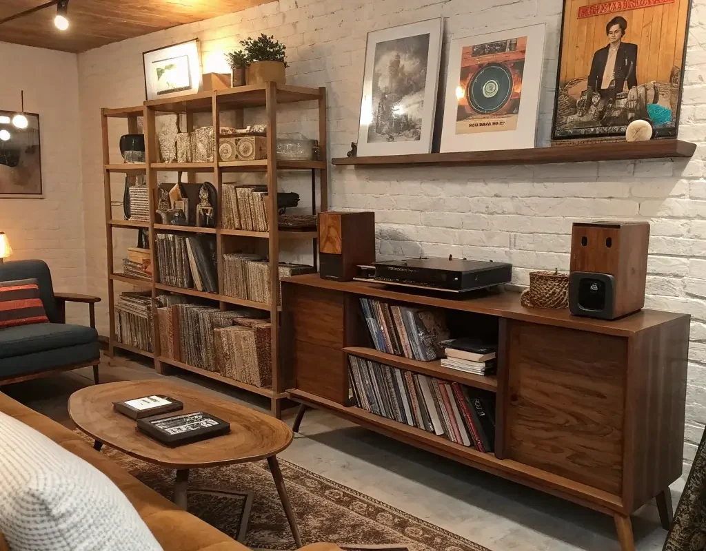
Okay, this one makes me ridiculously happy every time I look at it. Picture ledges or shallow shelves let you display albums like a record store, and you can actually flip through them when the mood strikes.
I installed three narrow shelves in my hallway, and now it’s basically a mini gallery that changes whenever I buy new vinyl. The beauty here? You’re not committing to any particular album being on display forever. Feeling moody? Throw some Radiohead up there. Having a party? Time for the disco covers to shine.
Shelf Styling Tips
Here’s what I’ve learned works best:
- Layer albums for depth – overlap them slightly
- Mix album sizes for visual rhythm
- Add small plants or collectibles between records
- Keep heavier albums on lower shelves (physics, people!)
Also Read: 15 Perfect Hallway Wall Decor Ideas for Any Style
Color-Coded Arrangement
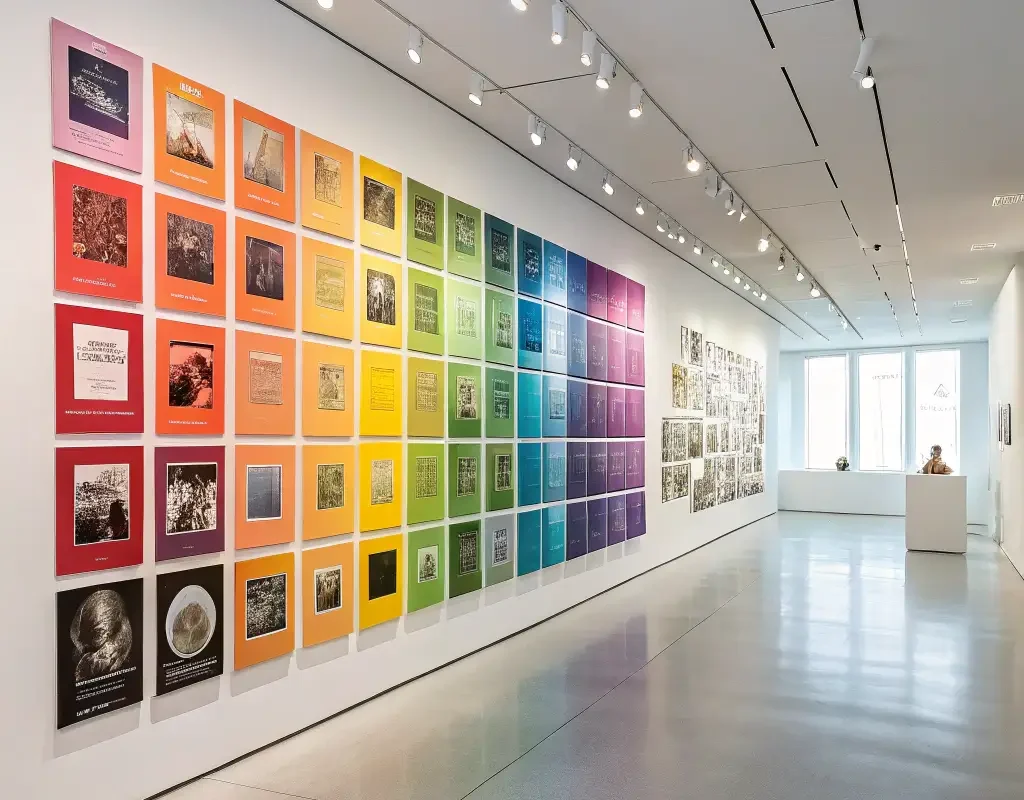
This approach speaks directly to my inner organization freak. Arranging albums by color creates an instant art installation that looks intentional and sophisticated. Ever notice how Instagram-worthy spaces often use color blocking? Same principle here.
Start by photographing all your album covers (or finding them online if you’re working with digital music). Group them by dominant colors, then arrange them in whatever pattern makes your heart sing. Rainbow order? Gradient effect? Monochromatic sections? Go wild!
Color Theory in Action
Think about:
- Warm colors (reds, oranges, yellows) create energy
- Cool colors (blues, greens, purples) bring calm
- Black and white albums make perfect buffers
- Metallic covers add unexpected sparkle
DIY Canvas Prints
Who says you need original albums to create amazing wall art? Turning album covers into canvas prints opens up endless possibilities, especially if your favorite albums only exist in your Spotify library.
I discovered this hack when I desperately wanted to display some obscure jazz albums that cost more than my rent in vinyl form. Upload high-res album artwork to any canvas printing service, and boom – you’ve got large-scale art for a fraction of the cost.
Making Canvas Prints Work
Consider these factors:
- Go big or go home – 16×16 inches minimum
- Group different sized canvases for gallery walls
- Choose albums with bold, graphic designs
- Matte finishes photograph better than glossy
FYI, some printing services offer multi-panel options where one album cover spans across multiple canvases. It’s dramatic and totally worth trying if you’ve got the wall space.
Minimalist Floating Panels
For my fellow minimalists who think less is definitely more, floating panels deliver maximum impact with minimum fuss. These ultra-slim displays let the album art breathe without any visual clutter from frames or mounting hardware.
I use acrylic panels with tiny standoff mounts that make albums appear to hover about an inch from the wall. The shadows they cast change throughout the day as light moves through the room. It’s basically living art that never gets old.
Achieving Minimalist Perfection
Remember to:
- Limit yourself to 3-5 albums max
- Choose covers with simple, striking designs
- Maintain plenty of negative space
- Align everything perfectly (this is non-negotiable in minimalism)
Also Read: 15 Easy Bathroom Wall Decor Ideas for Instant Charm
Geometric Pattern Wall
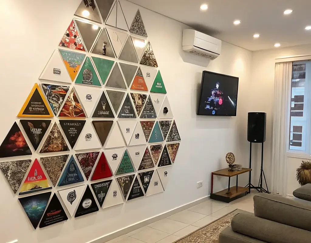
Want to know what gets people talking at parties? A geometric album display that plays with shapes and angles. This approach turns your music collection into an architectural element that’s impossible to ignore.
I arranged my albums in a diamond pattern once, and my friends literally thought I’d hired a designer. The trick is starting from a center point and building outward, keeping your angles consistent. A level is your best friend here – crooked geometric patterns just look like mistakes.
Pattern Possibilities
Try these configurations:
- Hexagon clusters for a honeycomb effect
- Zigzag patterns for movement
- Concentric squares for a target look
- Asymmetrical triangles for modern edge
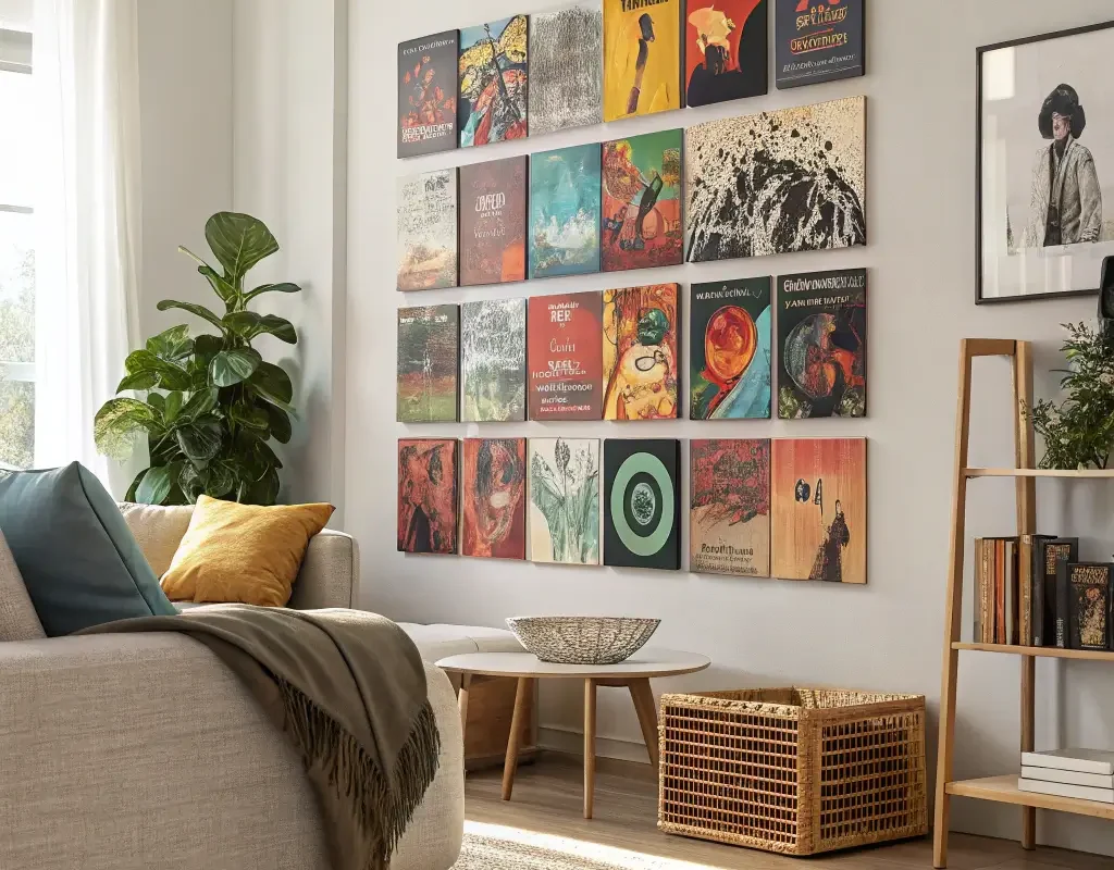
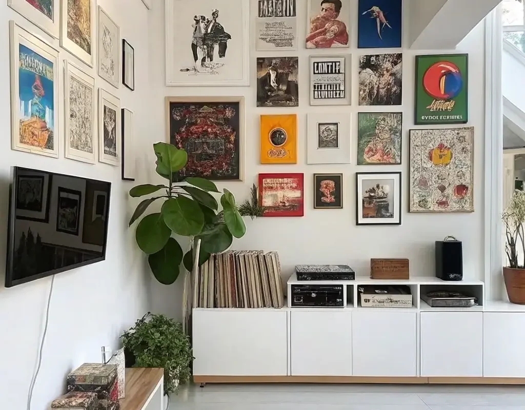
Album Cover Collage
Remember making collages in middle school? This is that, but way cooler. A collage wall lets you mix albums, concert tickets, band posters, and photos into one massive tribute to your music taste.
Mine started small – just a few albums above my desk. Now it’s evolved into this living document of every show I’ve attended, complete with setlists and wristbands. Every piece tells a story, and visitors always end up standing there for ages, discovering new details.
Collage Creation Tips
Here’s what makes collages work:
- Overlap elements for depth
- Mix sizes dramatically
- Include non-album music memorabilia
- Leave some pieces unframed for casual vibes
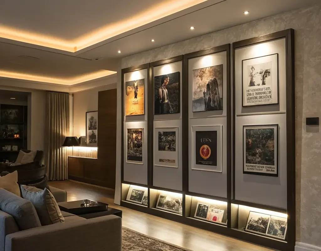
Shadow Box Frames
These bad boys take album displays to the next level by adding dimension. Shadow boxes let you display the album, liner notes, and even small memorabilia all in one frame. It’s basically a shrine to your favorite records.
I made one for my original pressing of “Dark Side of the Moon” with the concert ticket from when I saw Roger Waters perform it live. Is it extra? Absolutely. Do I regret it? Not even slightly.
Shadow Box Styling
Make the most of depth with:
- Layered elements at different heights
- LED strips for dramatic lighting
- Themed collections (all one artist or era)
- Mix of 2D and 3D objects
Also Read: 15 Unique Kitchen Wall Decor Ideas to Refresh Walls
Rotating Seasonal Display
Why commit to one look year-round when you can switch things up with the seasons? A rotating display keeps your space fresh and gives you an excuse to revisit different parts of your collection.
Every December, I swap in holiday albums (yes, even the cheesy ones). Spring gets jazz and bossa nova. Summer means surf rock and reggae. Fall? All the moody indie and classic rock. My walls literally change with my mood, and it never gets boring 🙂
Rotation Strategies
Keep it manageable by:
- Storing off-season albums in protective sleeves
- Using the same frames for easy swaps
- Planning transitions during regular cleaning
- Photographing each arrangement for reference
Backlit Wall Frames
Want to feel like you’re living in a high-end club or gallery? Backlighting your album displays creates drama that regular frames just can’t match. LED strips behind floating frames or built into shadow boxes make album art glow like stained glass.
I installed battery-powered LED pucks behind my favorite psychedelic rock albums, and the effect at night is absolutely mesmerizing. Plus, they work as ambient lighting when you’re not actively admiring your collection.
Lighting Techniques
Make it magical with:
- Warm white LEDs for cozy vibes
- Color-changing strips for parties
- Timer functions for automatic ambiance
- Dimmable options for versatility
Mixed Media Wall Art
Who says you have to stick to just albums? Combining album covers with other art forms creates unexpected visual interest that tells a more complete story about your taste.
My music wall includes album covers alongside band photography, vintage concert posters, and even some abstract paintings that capture the feeling of certain songs. The mix keeps things from looking too “themed” while still maintaining cohesion.
Mixing It Right
Balance your display with:
- Varying textures (glossy, matte, fabric)
- Different frame styles that somehow work together
- Consistent color palette throughout
- Personal photos from concerts or festivals
Leaning Shelf Display
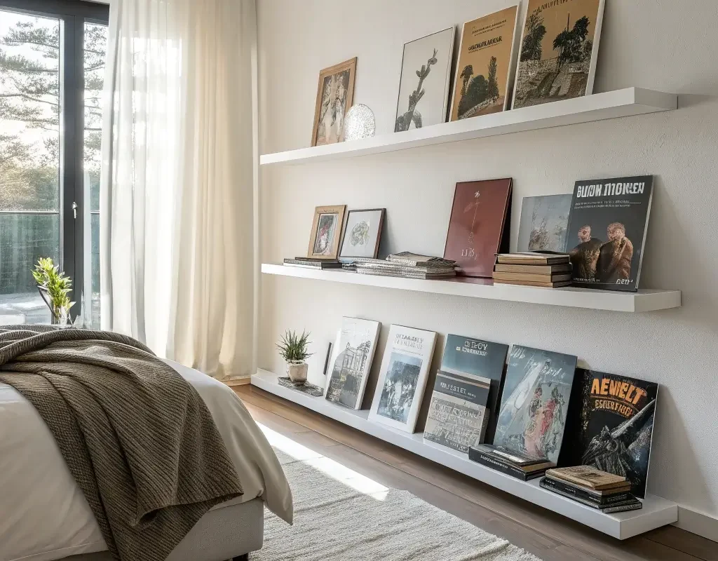
Sometimes the best displays are the least permanent ones. Leaning albums against the wall on shelves or mantels creates an effortless, changeable gallery that looks intentionally casual.
This works especially well if you’re renting and can’t put too many holes in walls. I’ve got a picture ledge where albums lean against the wall, overlapping slightly, creating layers of artwork that I rearrange whenever I’m procrastinating.
Perfecting the Lean
Master this look by:
- Varying heights with different album sizes
- Adding small objects between albums
- Creating depth with overlapping
- Keeping it slightly imperfect (too neat kills the vibe)
Floor-to-Ceiling Gallery
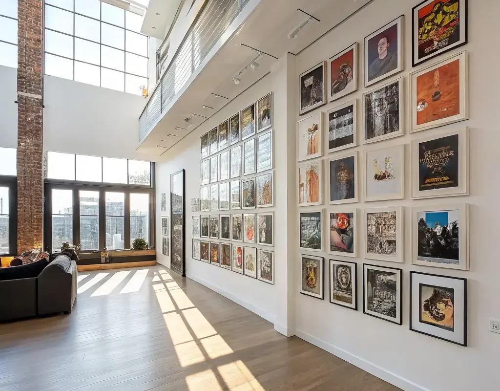
Go big or go home, right? A floor-to-ceiling album display makes a massive statement and basically becomes the focal point of any room. This isn’t for the faint of heart, but man, does it pay off.
I dedicated one wall in my home office to this, and it’s basically impossible not to feel inspired surrounded by that much album art. Started with the floor-level albums and worked my way up over several months. Now it’s like working inside a record store.
Scaling Up Successfully
Plan your monument with:
- Consistent spacing (crucial at this scale)
- Mix of frame sizes to avoid monotony
- Strategic placement of favorite albums at eye level
- Room for growth (always leave space for new additions)
Themed Music Corner
Sometimes focusing on one genre or era creates more impact than mixing everything together. A themed corner becomes a destination within your room – a place where specific musical memories live.
My jazz corner includes Blue Note albums exclusively, creating this cohesive blue-and-white gallery that feels like a tribute to the label. IMO, theming helps tell a story that random mixing just can’t achieve.
Theme Ideas That Work
Consider these focused approaches:
- Single decade (all ’70s punk or ’90s grunge)
- One record label’s releases
- Local bands and artists only
- Specific genre deep dive
- Color-specific albums only
Making It All Work Together
Here’s the thing about displaying album covers – there’s literally no wrong way to do it. Your wall should reflect your personality and musical journey, not some Pinterest-perfect ideal that doesn’t feel like you.
Start small if you’re feeling overwhelmed. Pick your absolute favorite album and frame it. See how it makes you feel having that art on your wall. Then add another. Before you know it, you’ll have created something uniquely yours.
The best part about using album covers as decor? Every piece has a story, a memory, a feeling attached to it. Your walls become this visual soundtrack to your life, sparking conversations and memories every time you glance at them.
Whether you go minimal with a few floating frames or maximize with a floor-to-ceiling installation, remember that this is supposed to be fun. Don’t stress about perfection – some of my favorite displays happened by accident when I was just messing around.
Music has always been about emotion and connection, and displaying album art brings that same energy into your physical space. So grab those albums hiding in your closet, pick up some frames this weekend, and start creating your own gallery. Your walls (and your guests) will thank you for it.